More test drives.
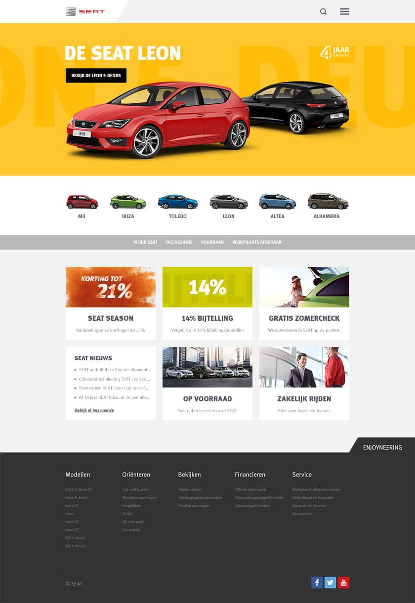
To match SEAT’s new design direction towards a younger and sportier brand, they were looking for a completely new online platform that could engage with their wide audience.
To match SEAT’s new design direction towards a younger and sportier brand, they were looking for a completely new online platform that could engage with their wide audience.
SEAT was evolving the design language across its product range to reflect modern times. Therefore their vision did not match with their online presence – a total makeover was needed to reflect their updated young and sporty direction as a brand.
SEAT cars are being imported by Pon, the No.1 auto importer in the Netherlands. They own the rights for many car brands. In addition to SEAT, they also import brands like Audi, Bentley, Bugatti, Lamborghini, Porsche, Volkswagen and many more.
Beside the new direction SEAT was taking as a brand, Pon was also looking to make the online platforms across multiple brands consistent. Valtech was the digital partner for this project and created a tailored Content Management System (CMS) that was built for all the different brands.
Based on this CMS and the evolution of the SEAT brand, we were tasked to design the new online platform that they were looking for.
I had collected a solid amount of data over a period of time, based on multiple campaigns that I had already created previously for SEAT. This enabled me to quickly identify the main pain points, target audience, as well as opportunities on how I could influence the users' behavior.
After reviewing this data and refining our personas, I collaborated closely with Valtech and SEAT to get a firm understanding of the technical limitations this project would have. I dived deep into the different components and Design Systems that were being used by other brands to try and see where things would overlap and could be re-used to save resources.
Getting a good understanding of the technical foundation that this online platform would be built on, enabled us to iterate quickly and improve our deliverables with every iteration.
The main purpose of the online platform was to inform users about the car offering and services, as well as attract potential new customers. I had to rethink the information architecture of the platform and translate it into a format that was more digestible for readers, as I learned from our user research that the old platform was hard to navigate.
Apart from transferring information in an attractive and easy-to-understand manner, I was tasked with increasing the conversion. As there are many different types of conversions in the car industry, this was proven to be a challenging task. By using multiple Persuasion Design techniques and consumer psychology, we were able to increase the conversion of new leads.
At the start of the project, I identified that SEAT was not yet in possession of high-quality photography that was reflecting their new brand direction. This was one of the reasons we decided to go with colorful backgrounds until the photography was sorted. At a later stage, SEAT had rolled out new photography worldwide. Based on this and user testing, we decided to replace the colorful artwork that was previously created, with the new photography to show the cars in their natural habitat.


